@RP131 - Bubble Chart Thread - 24/11/2021

This is an extended version of the daily 'Bubble' thread I post to twitter. This includes all the content from the twitter thread, along with additional material that has been trimmed to avoid bombarding people's timelines.

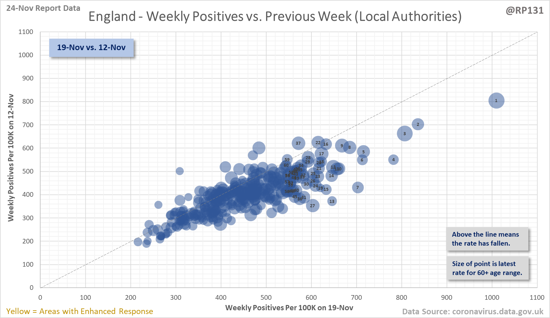
[1/4] Bubble chart thread for England local authorities. This type of chart allows us to quickly visualise week on week changes by seeing if the points are above or below the dotted line. The size of the dot is the relative level of positives in the 60+ age range.
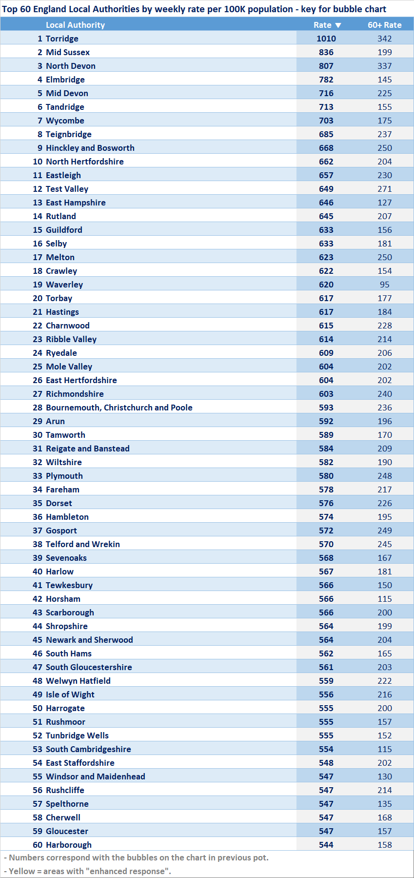
[2/4] Key for the chart in the above tweet.
[3/4] Link to the interactive version of this bubble chart: https://coviddatasha...naws.com/Bubble.html
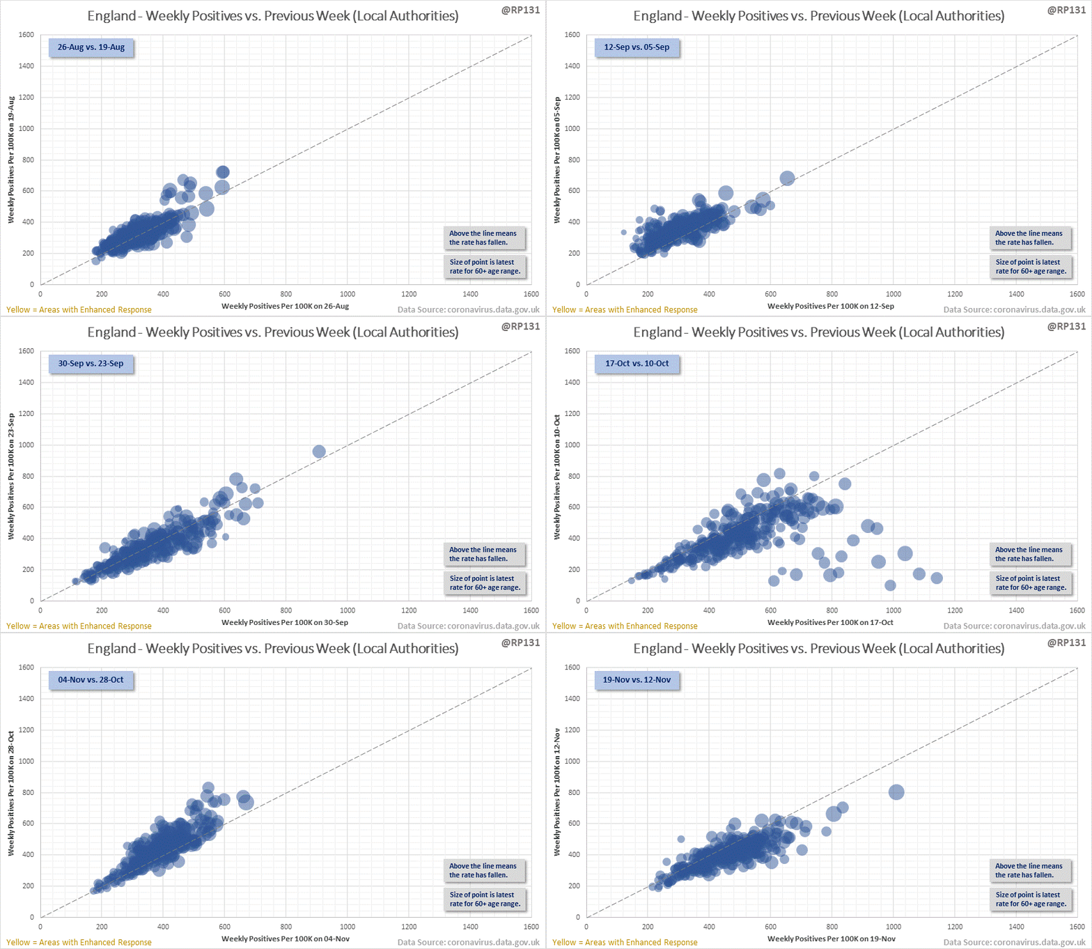
[4/4] Animated version of the Local Authority chart showing how things have changed since 90 days ago, up until the latest available age data (19-Nov).

Please feel free to use / share this content however you wish. Some form of link back to my twitter would be appreciated (e.g. mention me if posting on twitter).

If you find my work useful then any donations very much appreciated:

Buy Me A Coffee