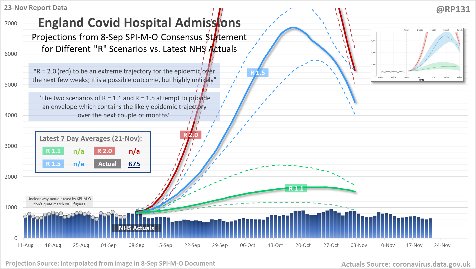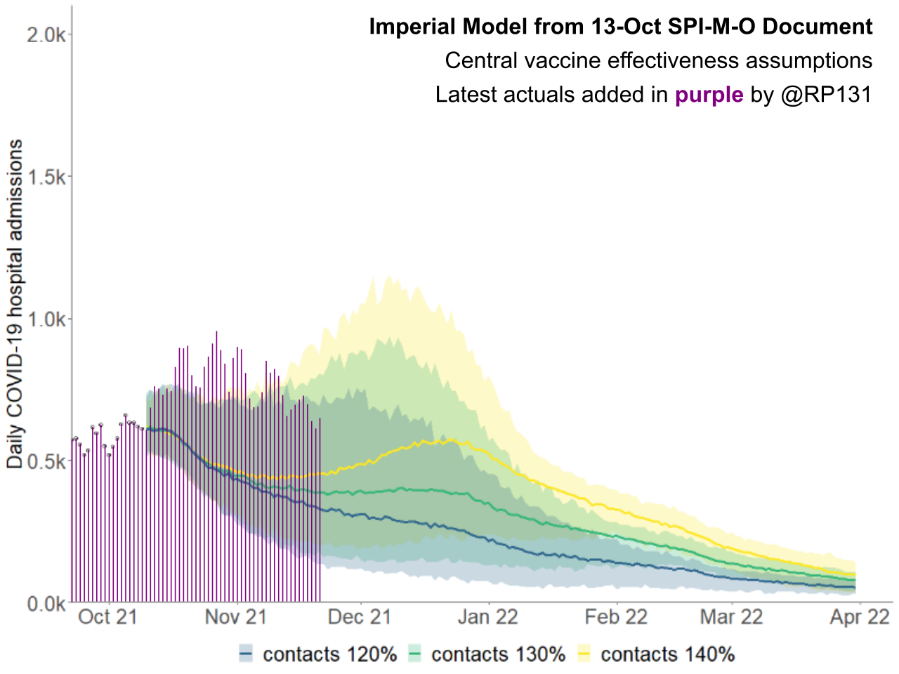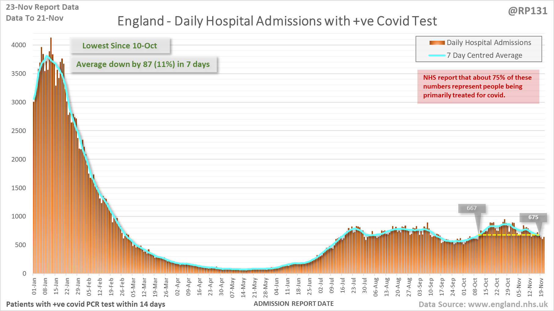
[1/18] Latest view on England covid hospital admissions (as of 23-Nov) with 648 reported for 21-Nov.
The 7 day average is now 675, equivalent to around 10-Oct (i.e. 39 days ago), a reduction of 87 (11%) in the last week.
The 7 day average is now 675, equivalent to around 10-Oct (i.e. 39 days ago), a reduction of 87 (11%) in the last week.
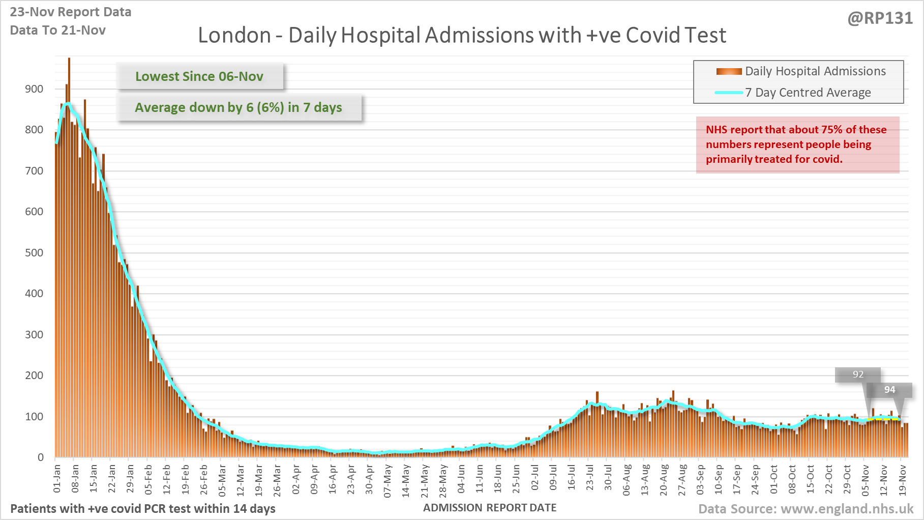
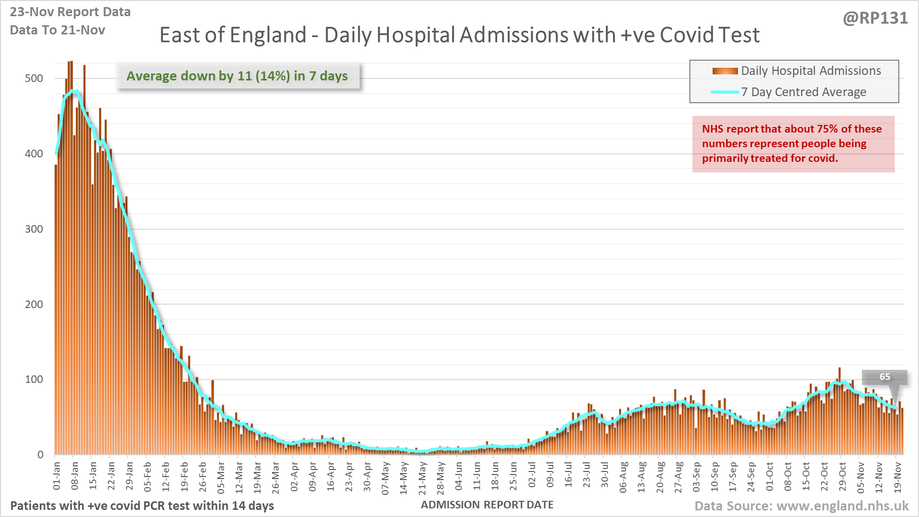
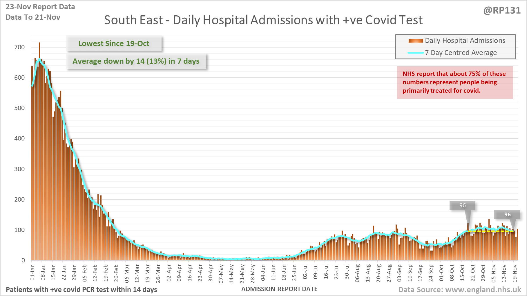
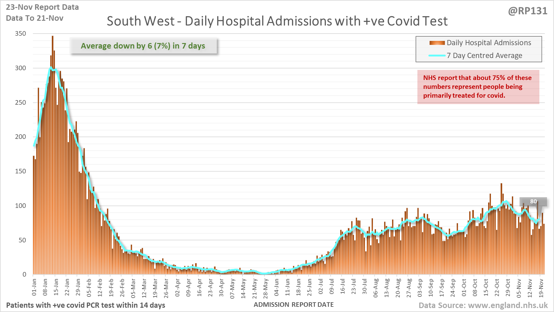
[2/18] Hospital admission charts for London, East of England, South East and South West. Note the different scales.
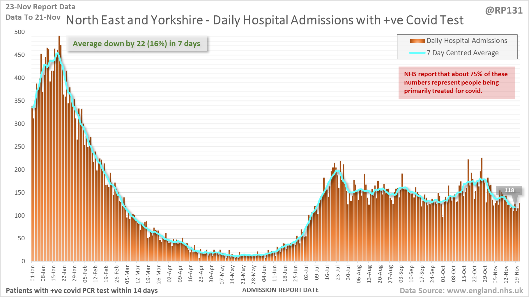
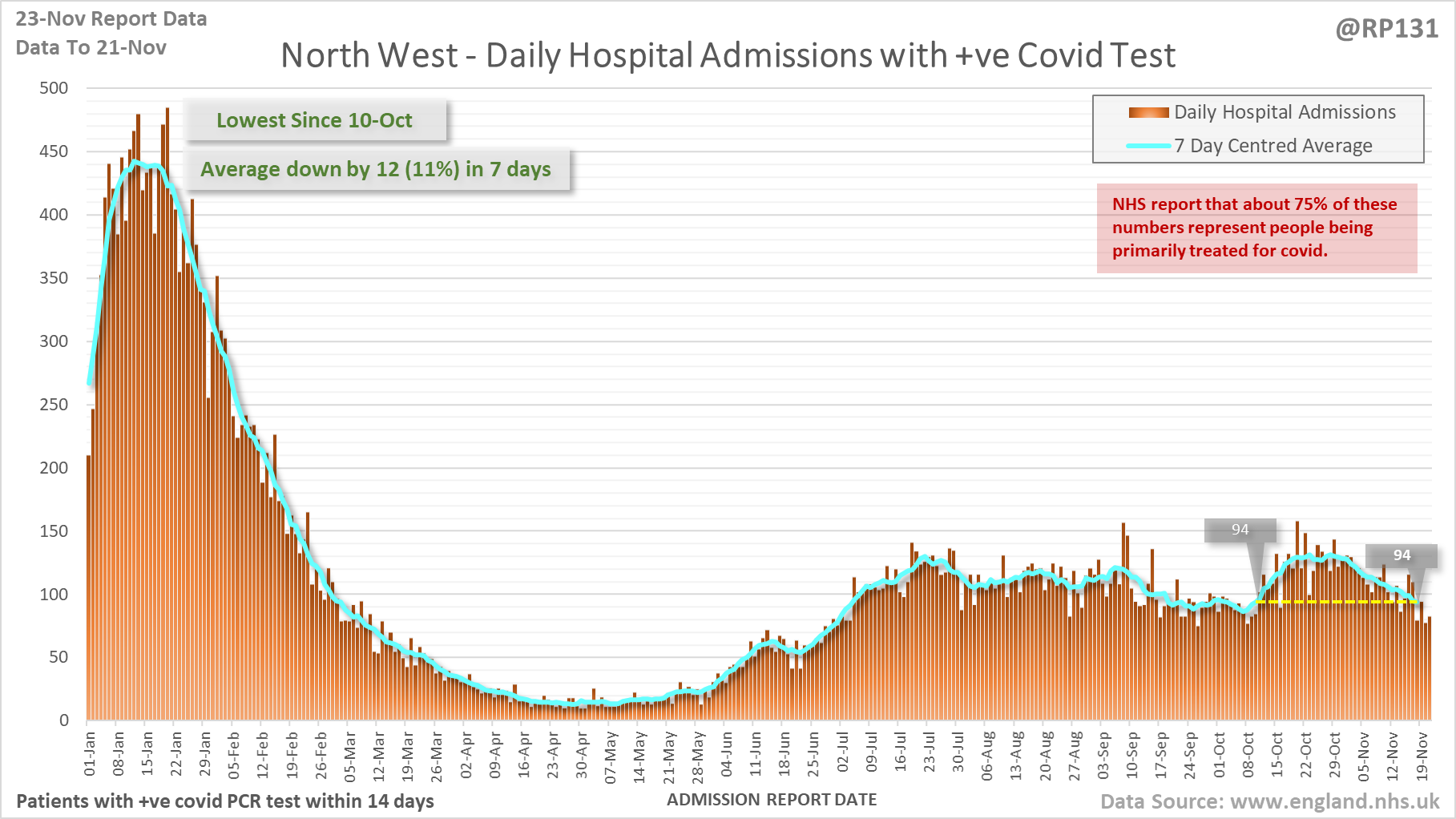
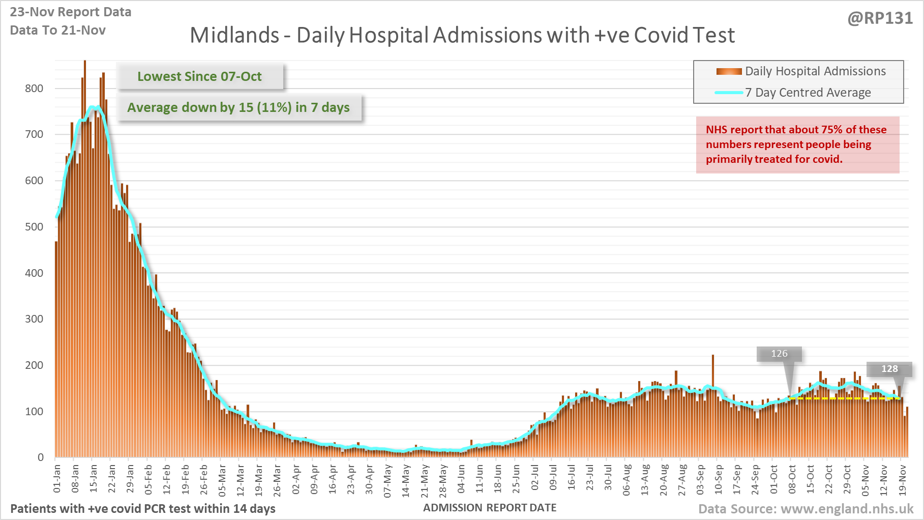
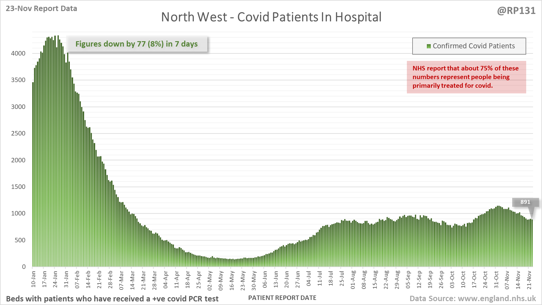
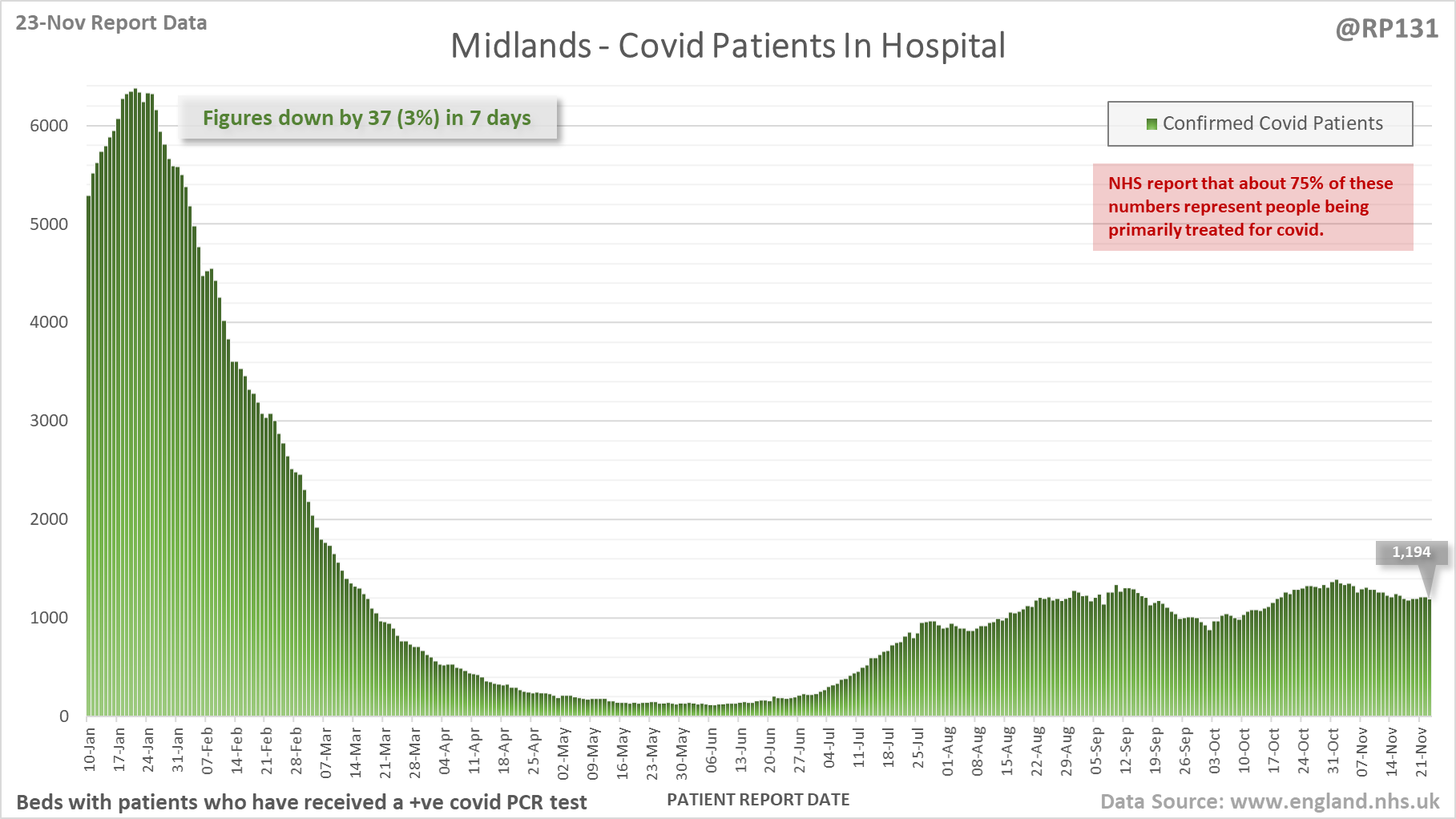
[3/18] Hospital admission charts for North East & Yorkshire, North West and Midlands. Note the different scales.
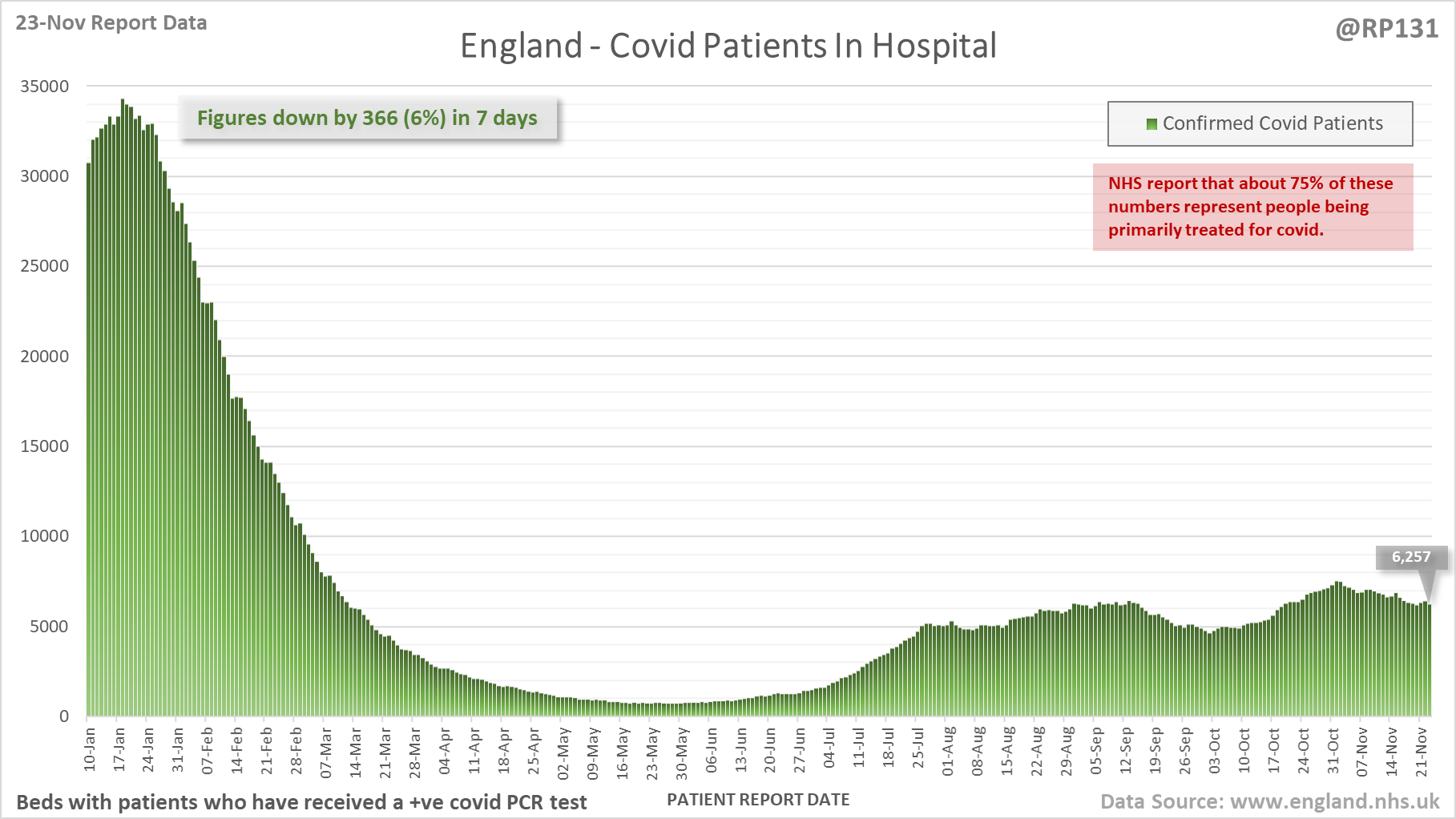
[4/18] Latest view on England patients with a +ve covid test currently in hospital, with 6,257 reported as of 8am on 23-Nov.
The count is now 6,257, a reduction of 366 (6%) in the last week.
The count is now 6,257, a reduction of 366 (6%) in the last week.
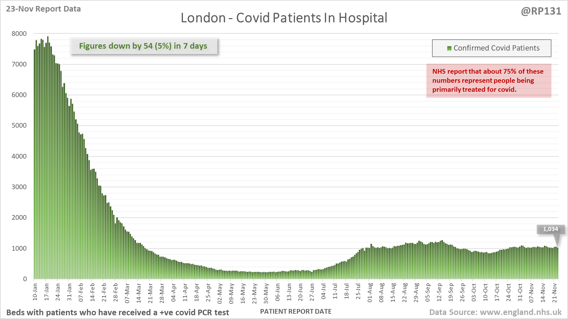
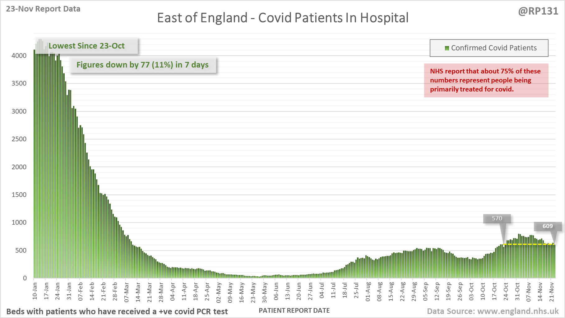
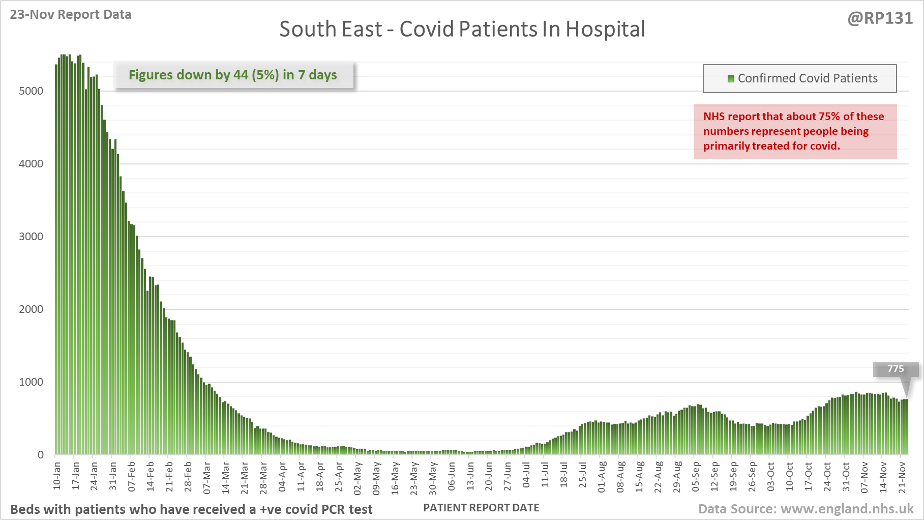
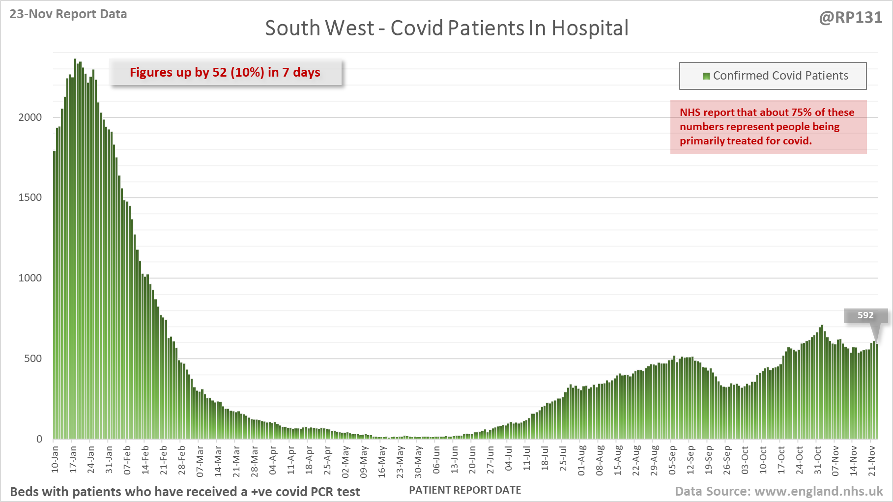
[5/18] Hospital current patient charts for London, East of England, South East and South West. Note the different scales.
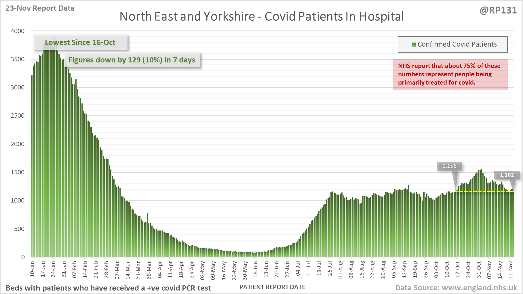
[6/18] Hospital current patient charts for North East & Yorkshire, North West and Midlands. Note the different scales.
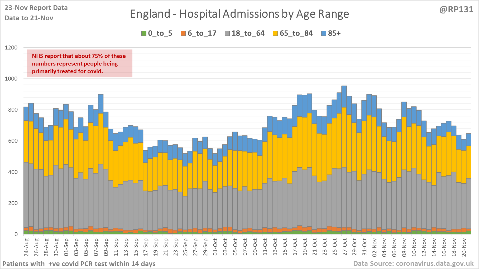
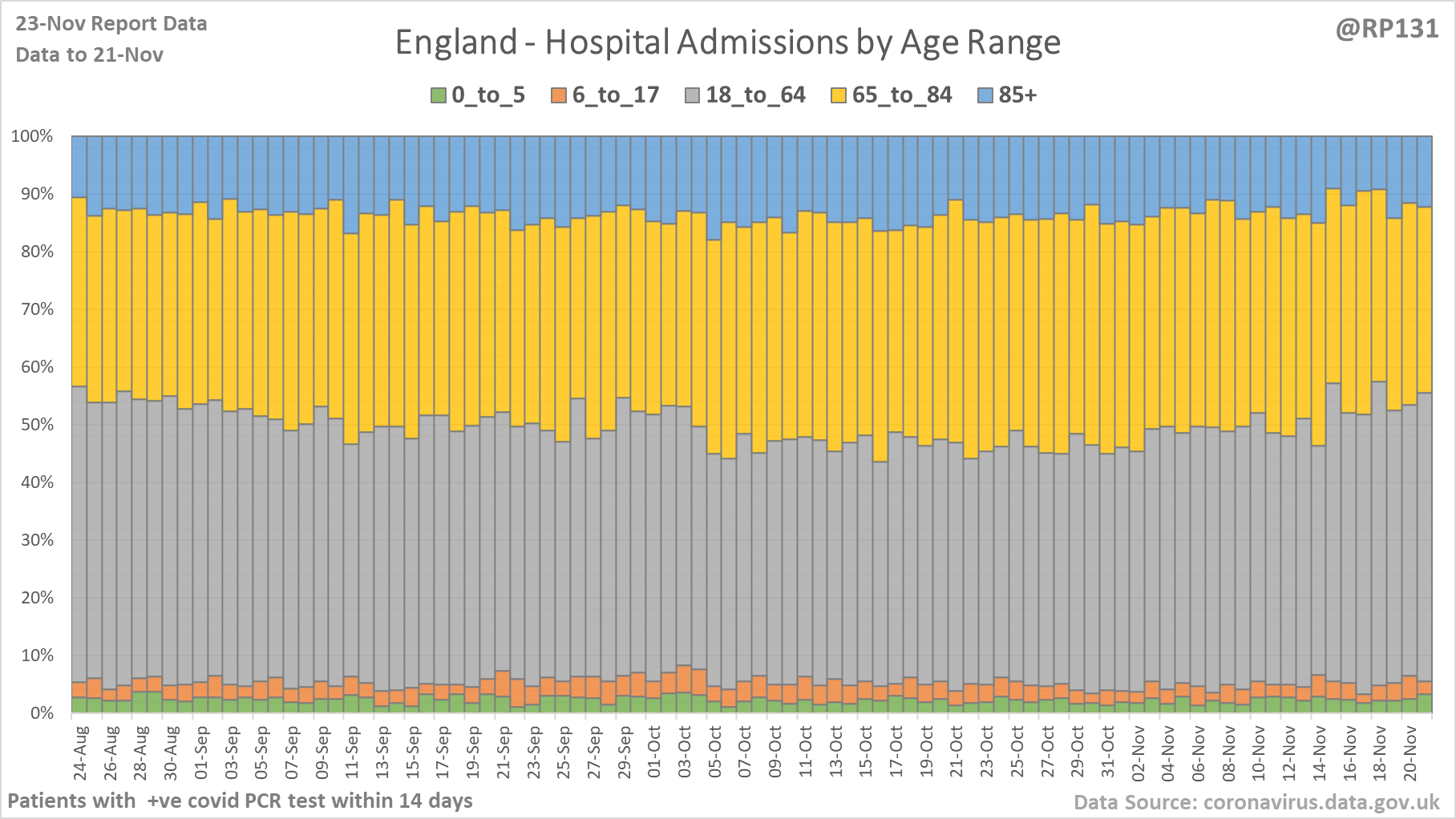
[7/18] Age ranges of England hospital admissions. Note this age-range data lags a day or so behind the above totals data.
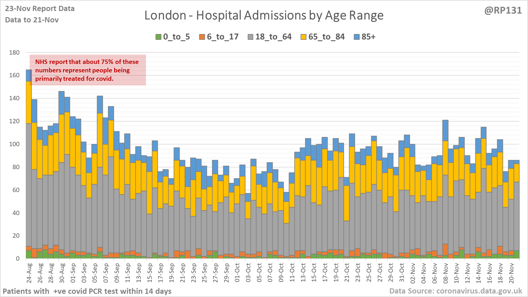
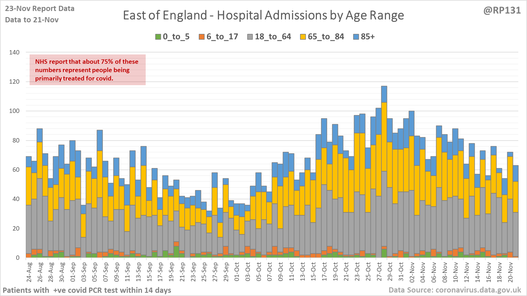
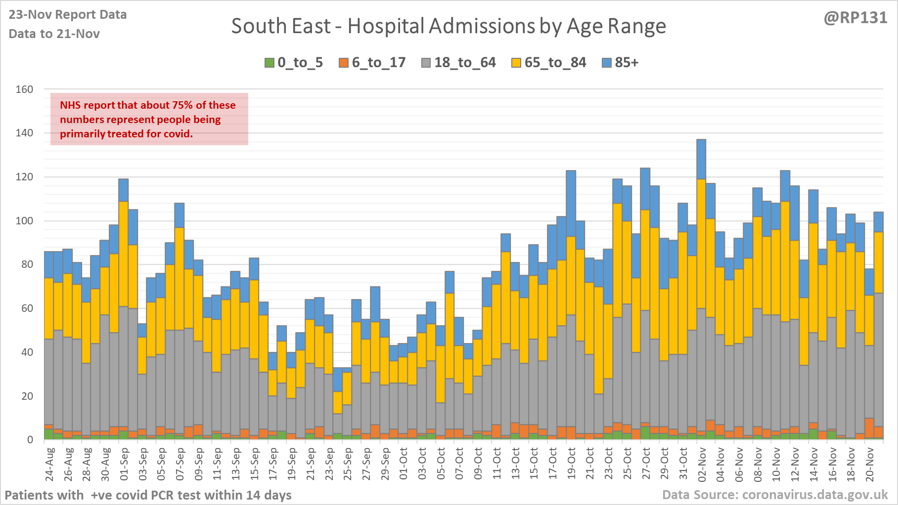
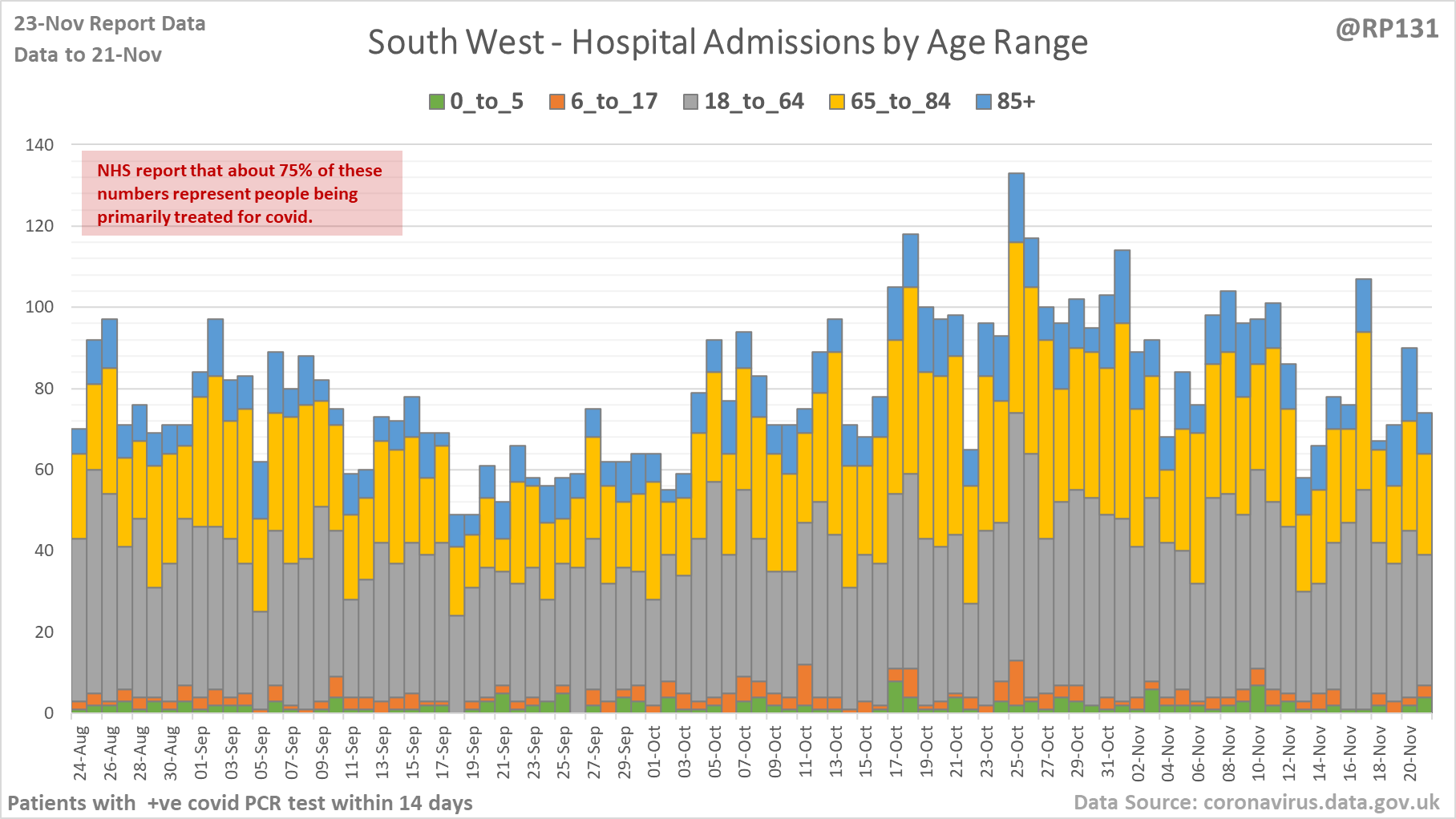
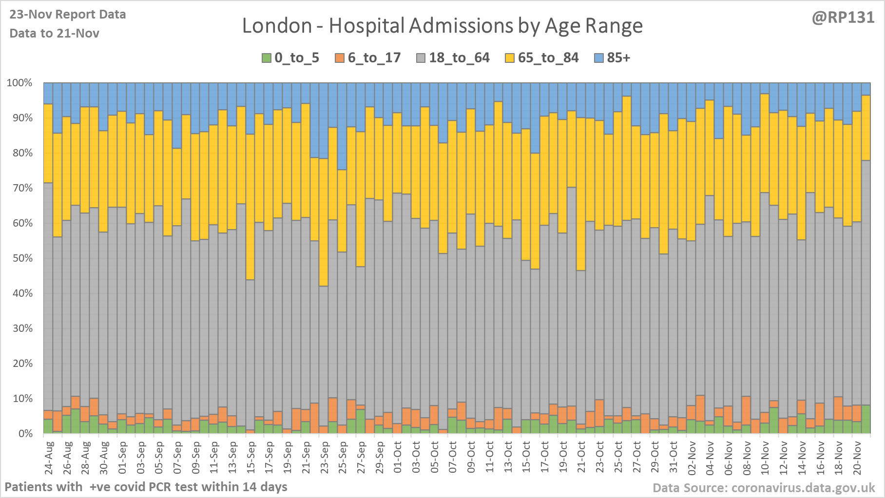
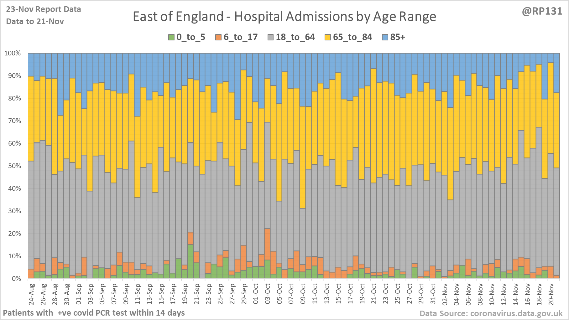
[9/18] Hospital age ranges of admissions for NHS regions London, East of England, South East and South West.
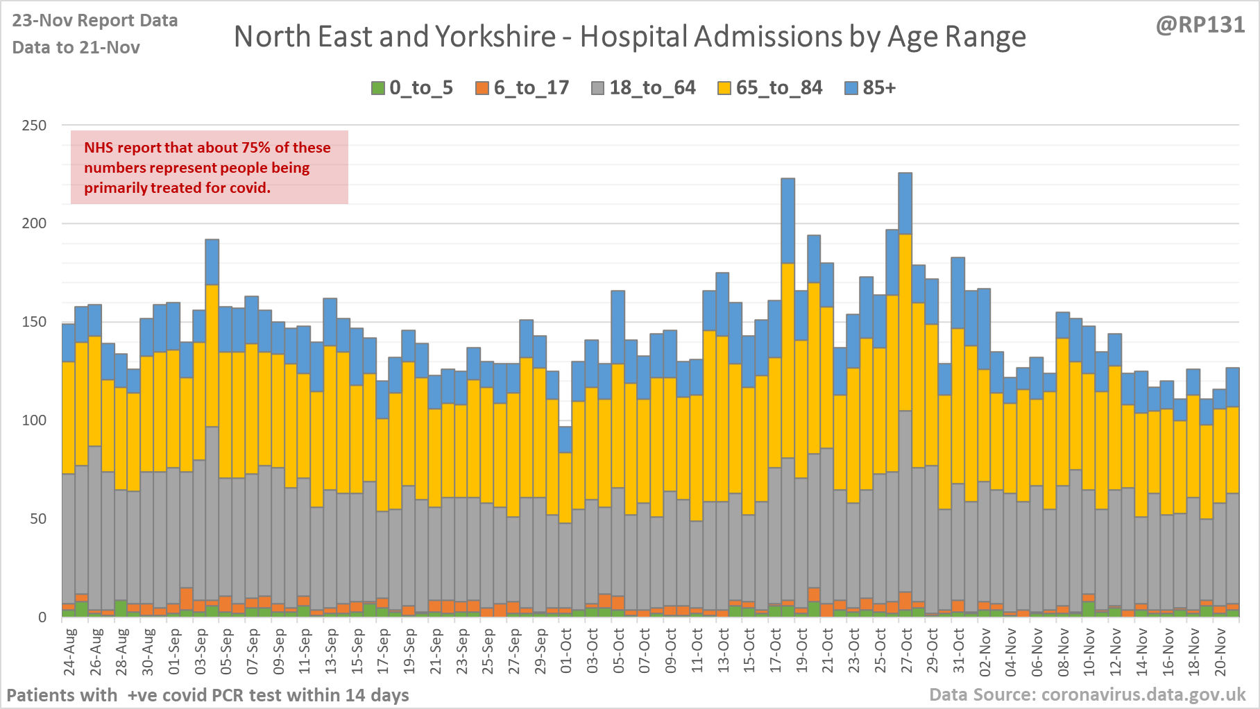
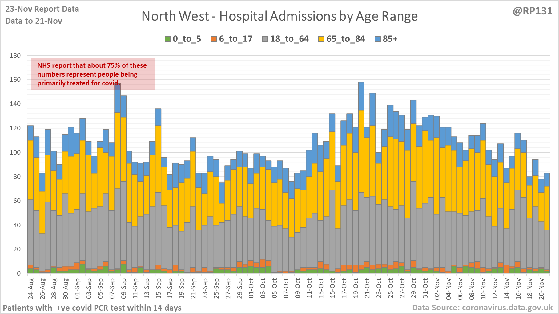
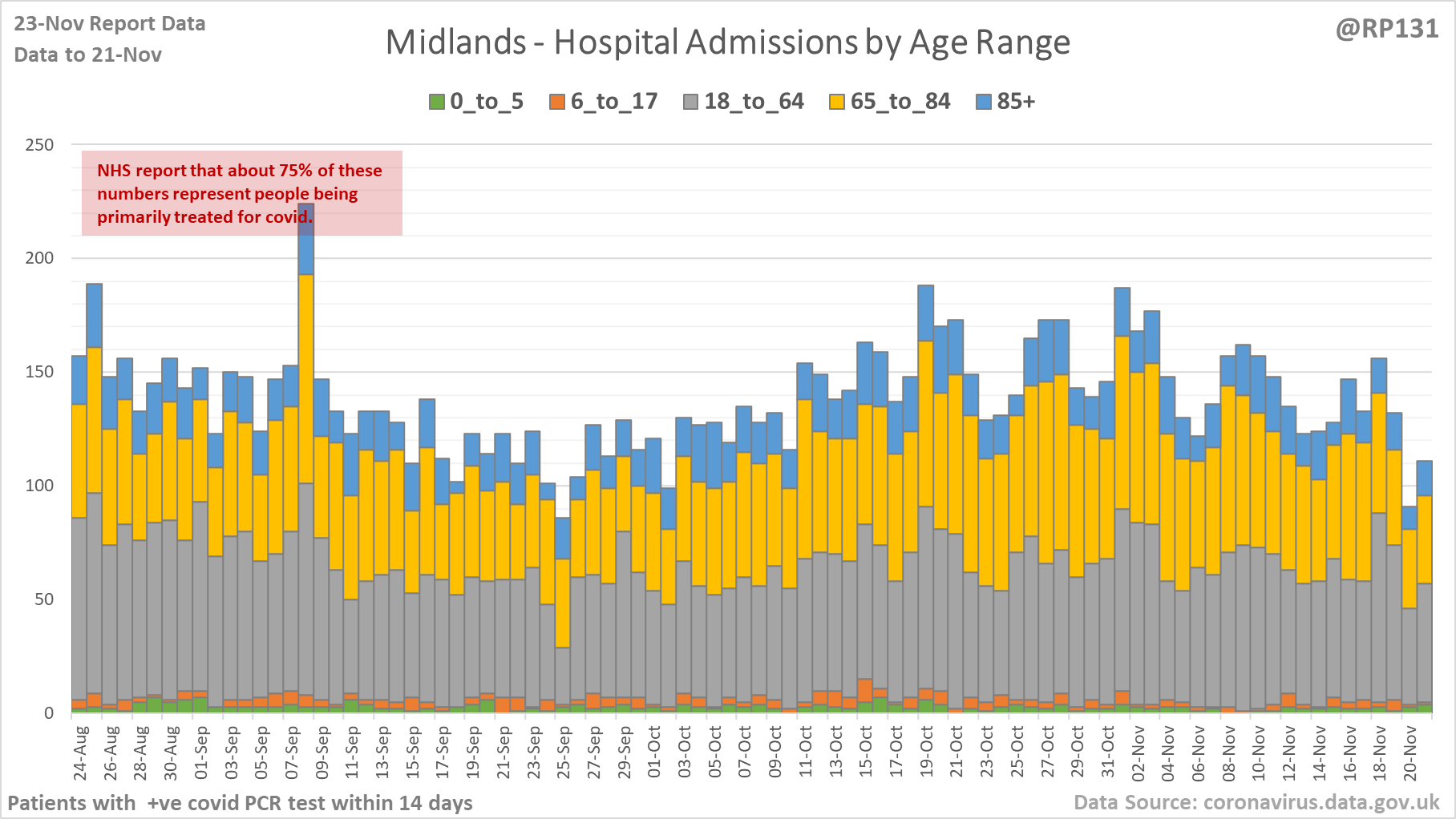
[10/18] Hospital age ranges of admissions for NHS regions North East & Yorkshire, North West and Midlands.
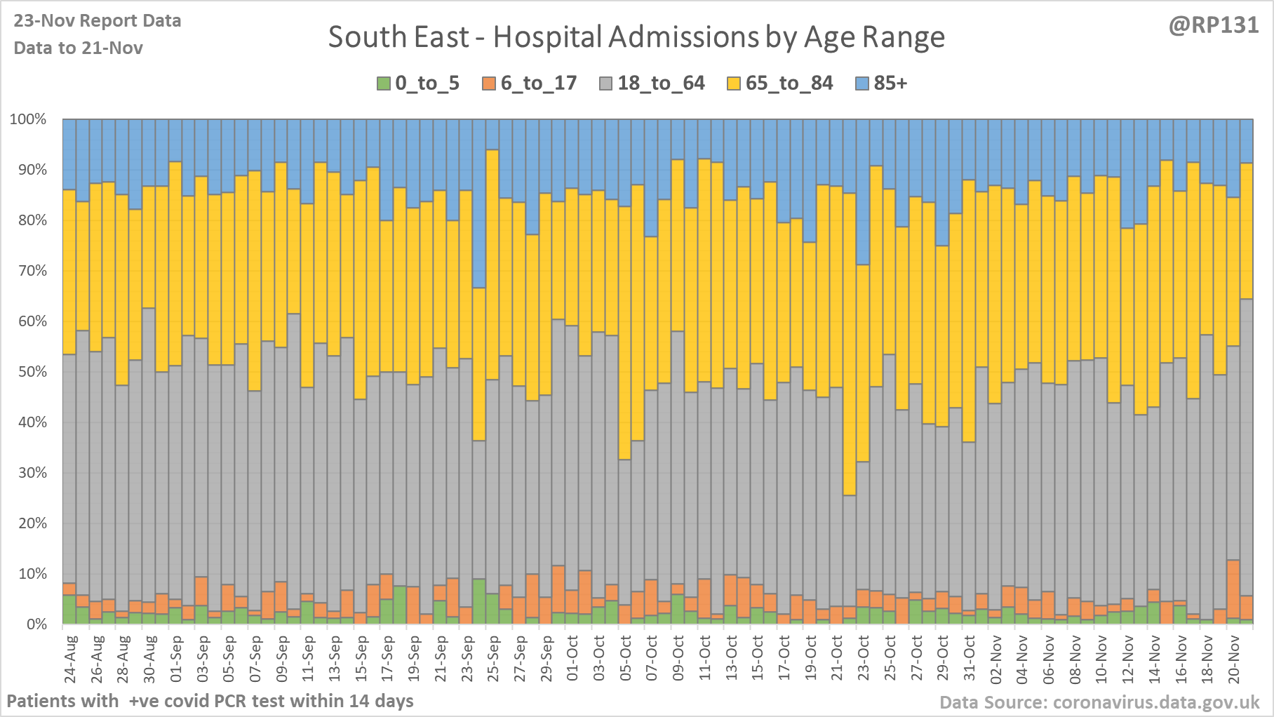
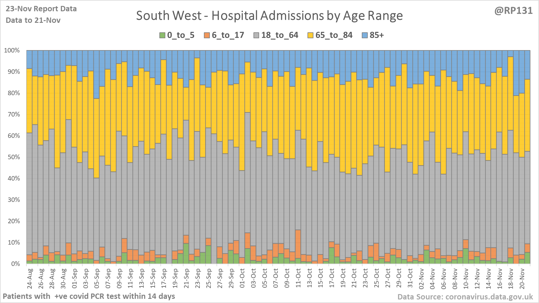
[11/18] Percentage view of hospital age ranges of admissions for NHS regions London, East of England, South East and South West.
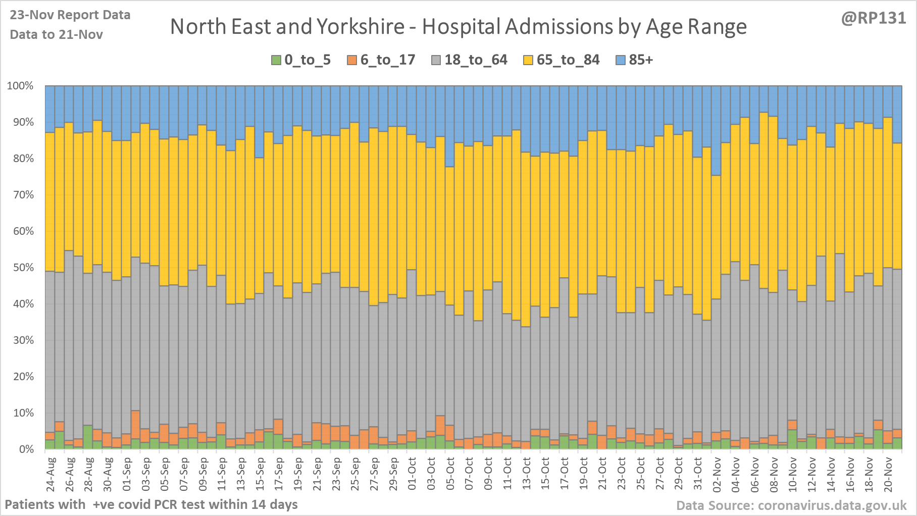
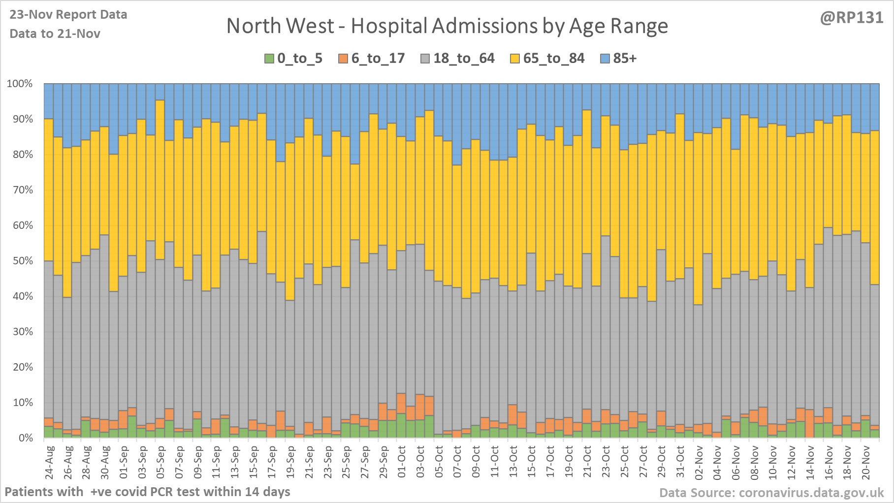
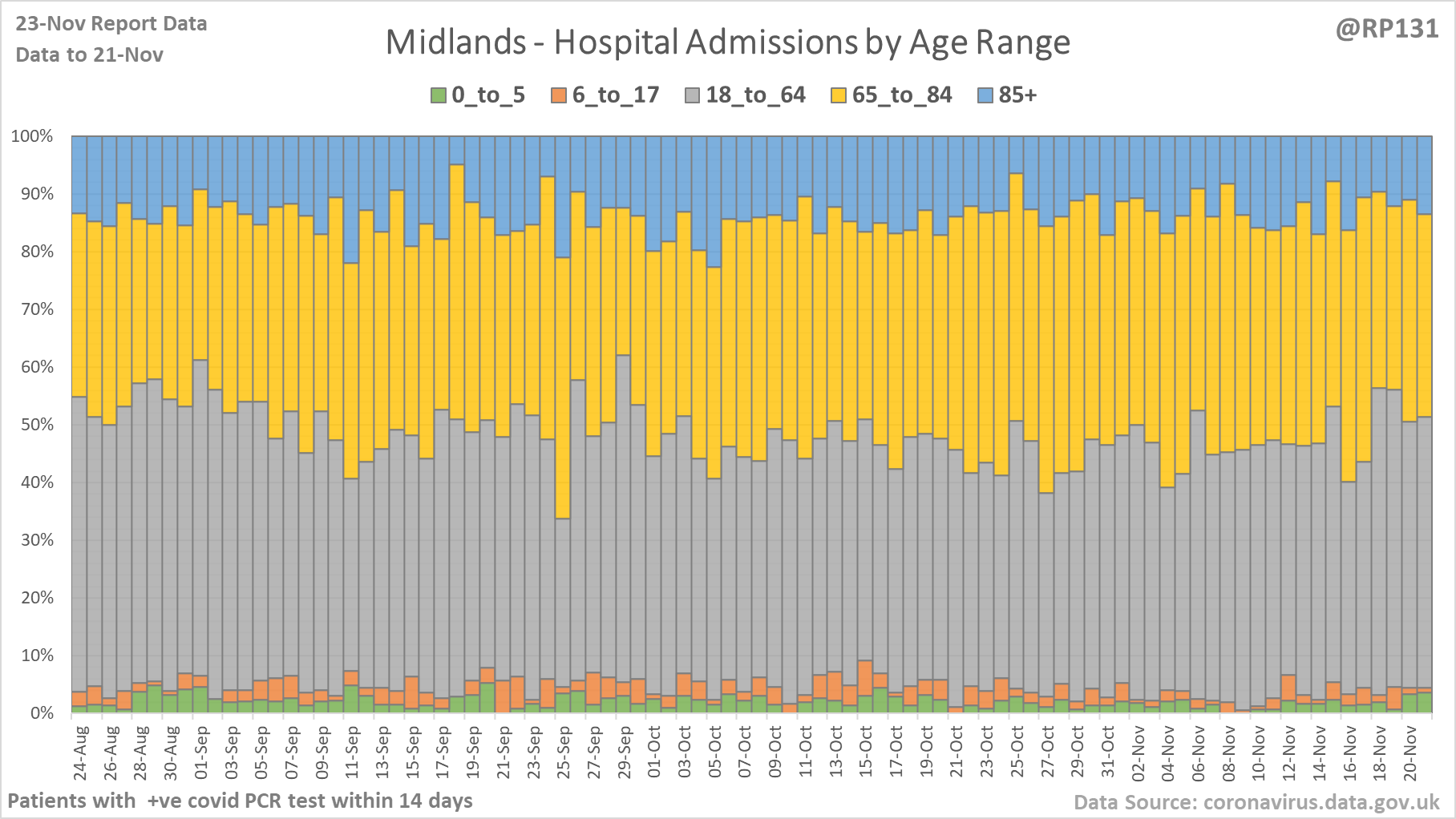
[12/18] Percentage view of hospital age ranges of admissions for NHS regions North East & Yorkshire, North West and Midlands.
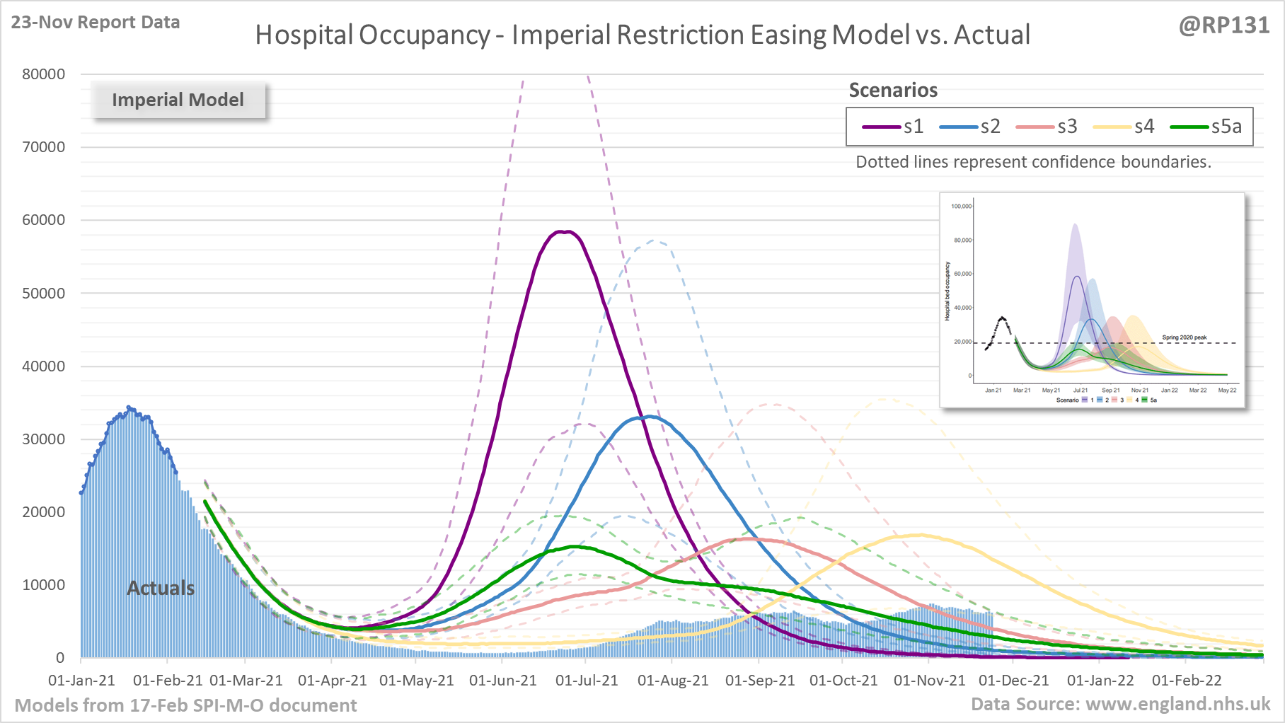
[13/18] Chart to compare current England hospital bed occupancy actuals against the various scenarios of the Imperial model from the 17-Feb SPI-M-O document on easing of restrictions.
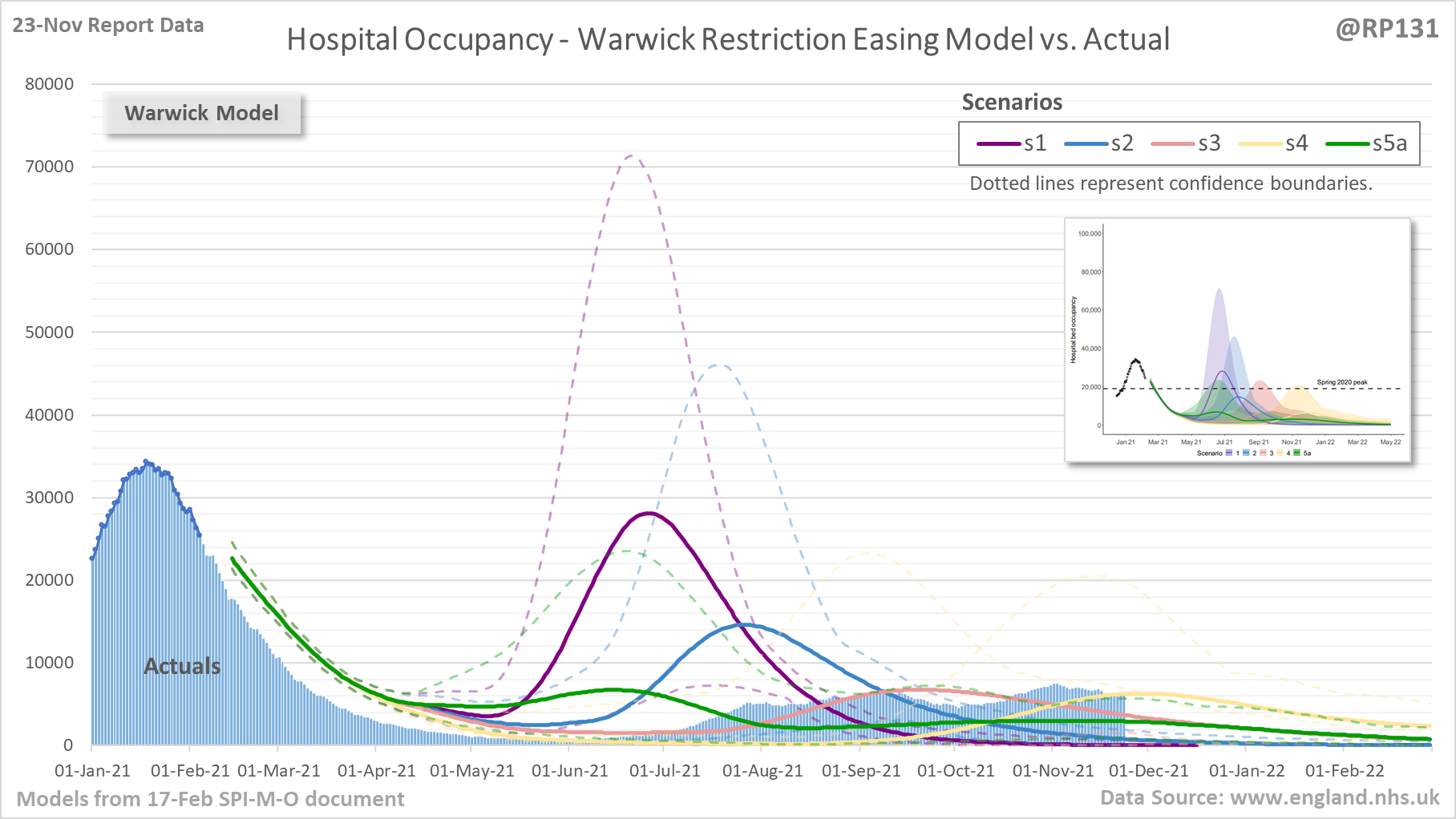
[14/18] Chart to compare current England hospital bed occupancy actuals against the various scenarios of the Warwick model from the 17-Feb SPI-M-O document on easing of restrictions.
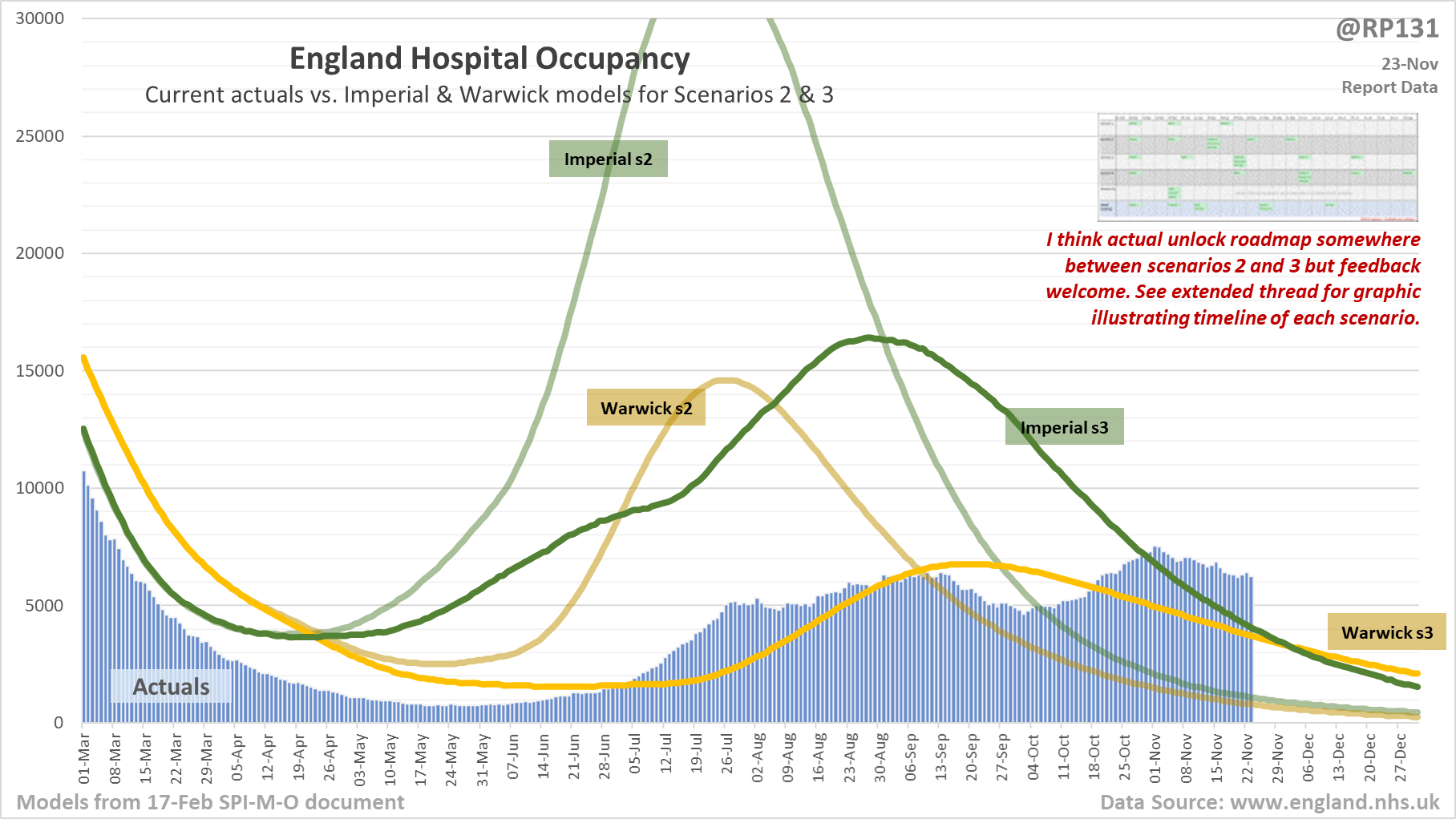
[15/18] Closer look at current hospital occupancy actuals against Imperial/Warwick models for scenarios 2 and 3, which I think are the closest to the gov't adopted roadmap.
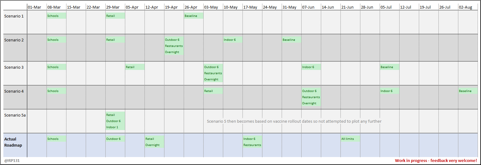
[16/18] Timeline illustration of the various scenarios used for the modelling that supported unlock roadmap planning. Work in progress - feedback welcome!
